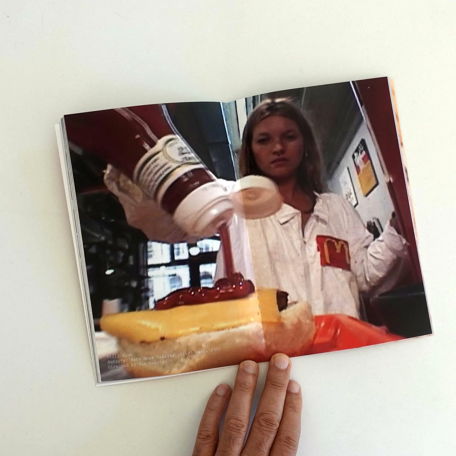
Tom Sachs McDonald's Worldbuilding
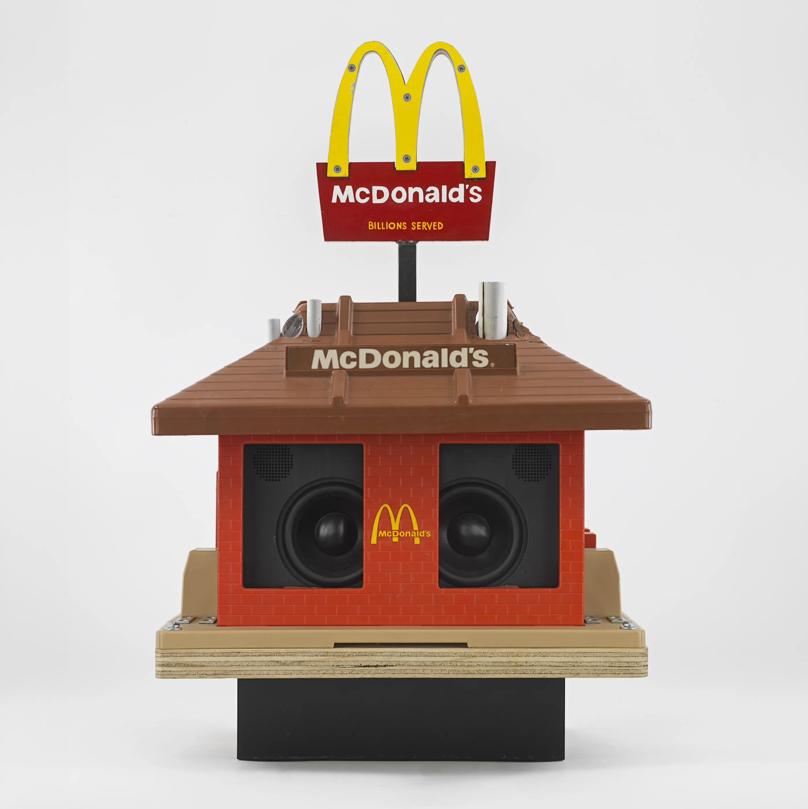
Tom Sachs. Big fan of that studio’s work. Worldbuilding disguised as art. Creating little expansive immersive worlds that teeter between what was, what could have been. Adjacent timelines just slightly skewed from what we know. Or, perhaps a bit of the not true *yet.
I just got this catalog that dropped alongside of an exhibit he had in Chicago at Anthony Gallery. Chicago is the home of McDonald’s, or at least home to their corporate headquarters so that all makes some kind of sense. I managed to move quickly enough to get this McDonald’s Catalog Raissoné, which got me to thinking: maybe a quick set of reflections on Tom Sachs’ in the context of Design Fiction, especially seeing as how I discussed it in that essay I wrote back in 2008 that kicked this whole thing off?
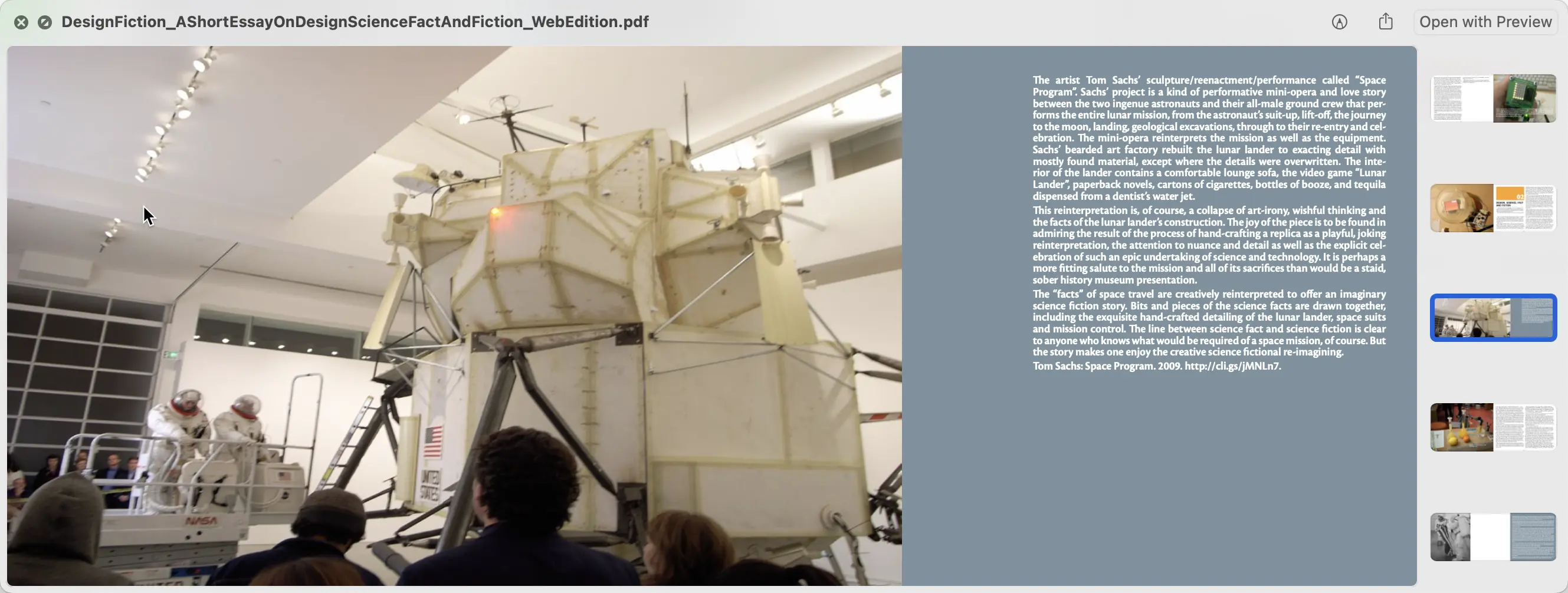
I remember seeing Space Program when it launched at the Gagosian here in Los Angeles. Kyle Ng took me there before the opening event. There was no one in the gallery. I’m pretty sure it was closed. We got to climb up into the LEM (Lunar Lander) and root around inside. That was like entering into my 8 year old imaginary as to what the inside of an Apollo Lunar Lander was like. It was a container of a boy’s adolescent fantasy about space travel. There were poetry books. The water spigot spat out Jack Daniels. The cabinets were annotated with handwritten Sharpie® markings to label what supplies lied inside.
We’re inside a kid’s fantasy treehouse, basically.
Etcetera.
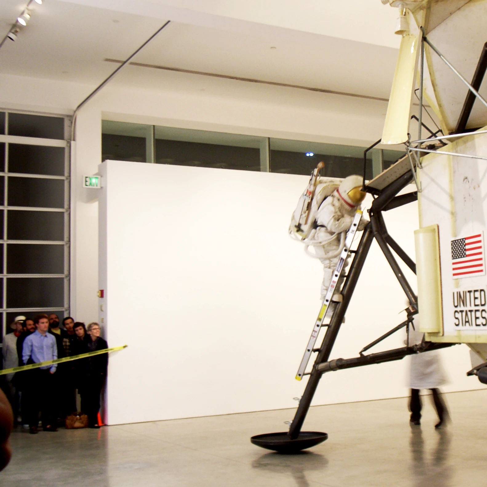
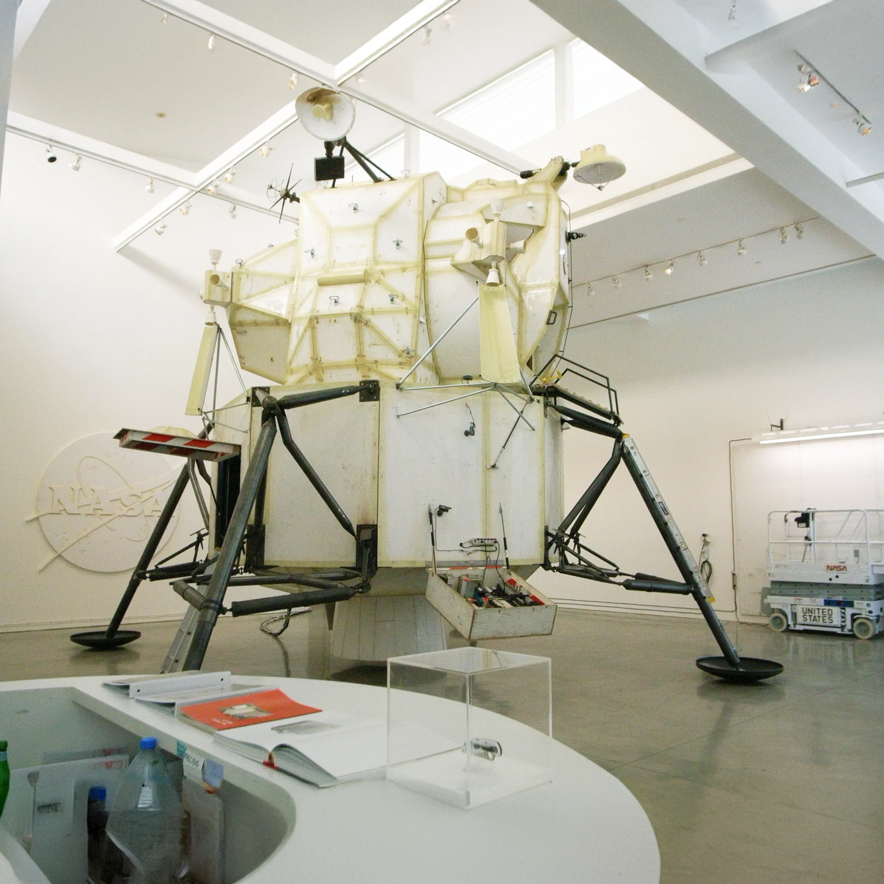
Sachs is an American contemporary artist known for his work that often blends art, engineering, and craft to create meticulously detailed sculptures — I guess that’s what you’d call things like the LEM I clambored into — installations, and environments. His work is frequently centered around themes of exploration, particularly space exploration, which he approaches with a DIY ethos that emphasizes the process as much as the final product. Projects like “Space Program” involve elaborate, hand-crafted recreations of NASA equipment and missions, transforming everyday materials into complex, narrative-driven artworks.
I think what draws me to his work is the worldbuilding. He makes artifacts — actual physical objects — and this is what Design Fiction does. Sachs’ artifacts his work to create compelling immersive or speculative environments that allow one to laugh while also providing a critical reflection on our current and future realities, making his work a powerful example of how art can intersect with design to explore and question possible futures, alternative pasts, and even adjacent nows.
Design Fiction is not about telling stories in a traditional sense but about creating artifacts that imply stories and suggest possible futures, alternative realities, and adjacent presents.
Sachs work has definitely informed Design Fiction, no doubt. As I mentioned, it founds its way into that essay I wrote back in 2008, “Design Fiction: A Short Essay on Design, Science, Fact, and Fiction” as I was trying to write my way through getting a handle on the notion of instrumentalized science-fiction for the engineer.
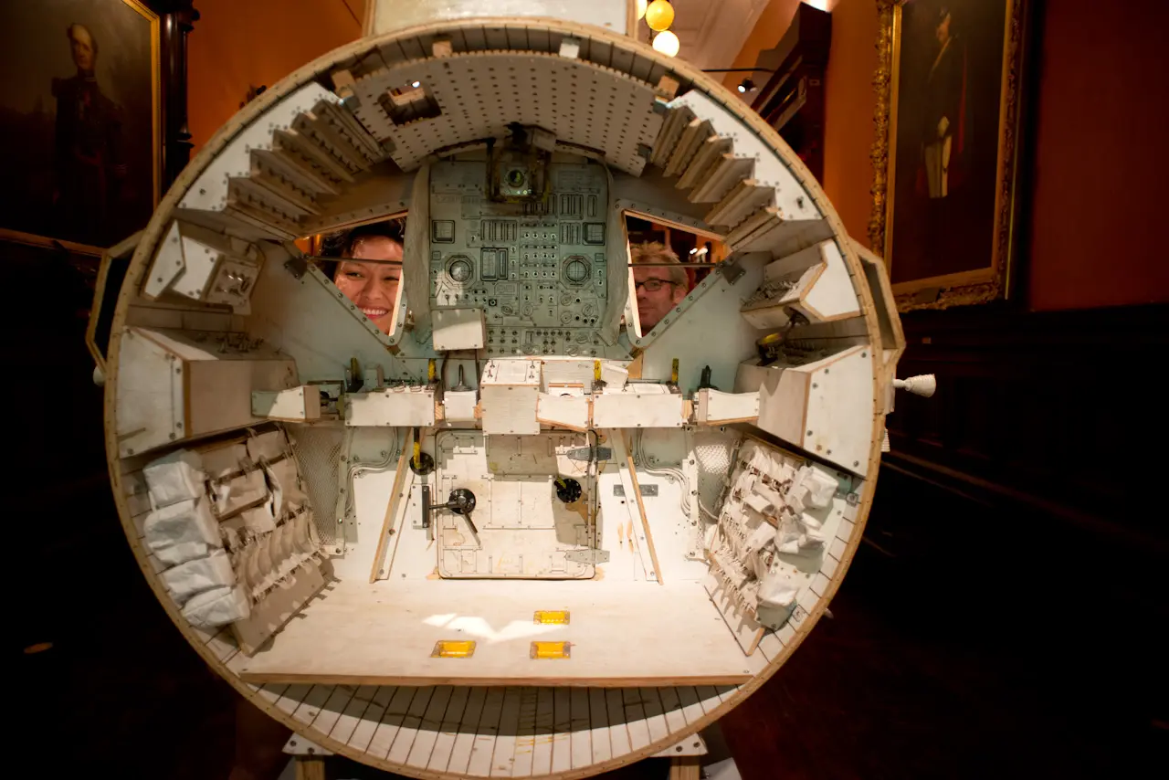
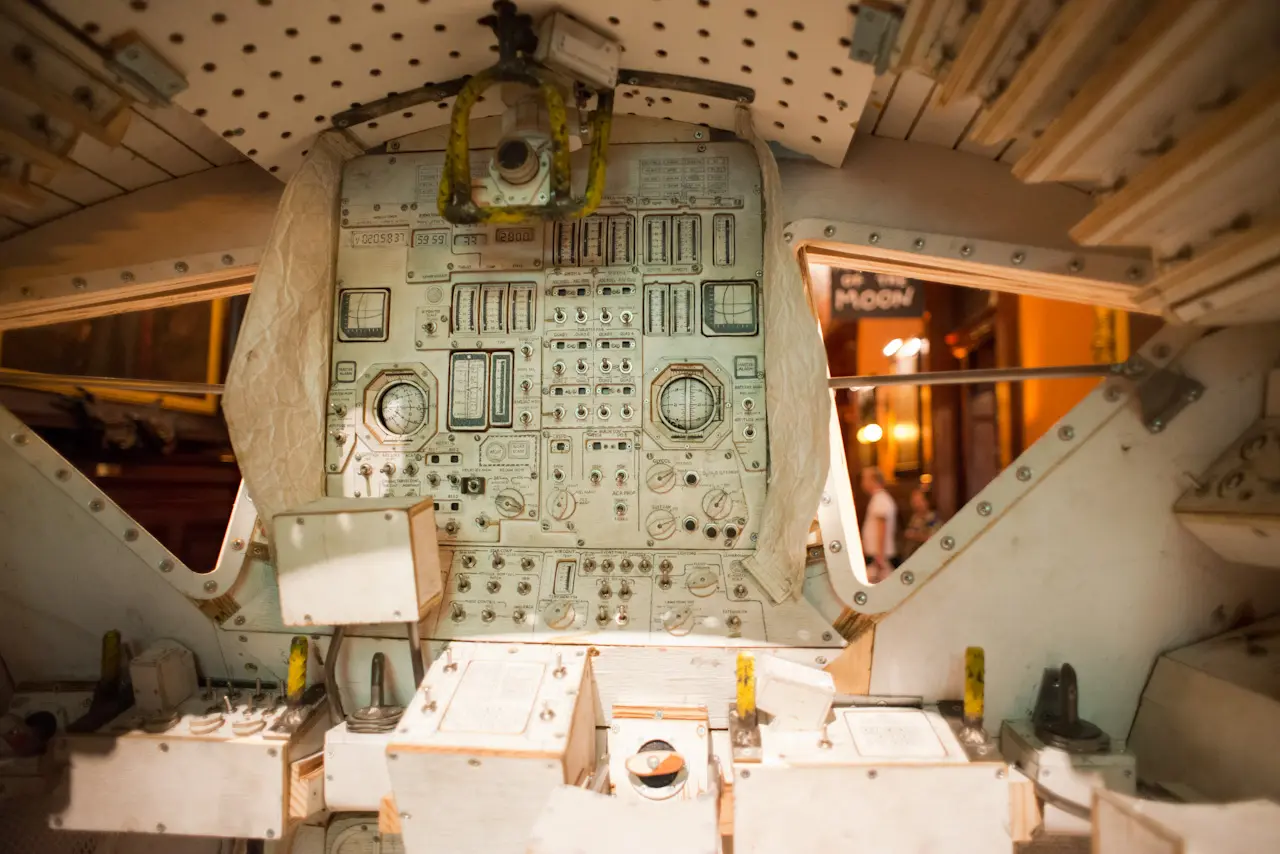
A common theme or aesthetic: Constructing objects and environments that are rooted in our current reality, while also existing in a space that challenges and reimagines that reality. Sachs’ sculptures and installations serve as speculative artifacts from an alternate present or near future. They are a form of conversation-starter that are playful, approachable, and, I suppose this is the edge of the ‘art’ or aesthetic component, the work often exhibits a kind of ironic component.
Sachs’ use of mundane, ordinary materials to construct sophisticated objects can be seen as a form of critical design, another concept closely related to Design Fiction. By using materials like plywood, foam core, and duct tape to construct intricate representations of space travel equipment, Sachs critiques the fetishization of technology and the polished, inaccessible nature of high-tech objects. His work invites audiences to question the authenticity and authority of such objects in our society, much like how Design Fiction challenges the taken-for-granted assumptions about technology and its role in shaping the future.
In his McDonald’s installation, Sachs created a fully functional fast-food restaurant, meticulously replicating a McDonald’s kitchen using his typical, rough-edged, handmade, DIY craftsmanship. He does not just replicate the equipment fround in a McDonald’s restaurant; he recontextualizes it, blending the line between functional and fictional, real and imagined. The installation includes working equipment, like fryers and soda machines, all made from everyday materials. The restaurant was fully operational during the exhibition, with visitors able to order and eat food prepared by Sachs and his team. A typical Sachs project includes these kinds of experiential, immersive events where the action and activity is the work, and completes the worldbuilding component.
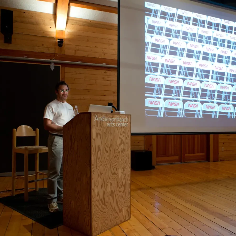
Why do this? Well, ‘it’s fun!’, and nowadays we could use some fun!. Sachs’ Playskool Art, brings one into a mindset that sees the world as malleable, miniturizable, approachable, plalyful. His work is a bit Montessori School and a bit grown-up commentary. After the fun, his work also serves as a gesture towards a critique of global capitalism, consumer culture, and the commodification of food, possibly.
That is also where the art lies.
There are a handful of ways to open up questions about the state of the world, including turning the dark shadow of these things and reflecting them back to the world through criticism, essays, ‘actions’, and so forth. By recreating a McDonald’s, Sachs highlights the standardization and uniformity of the fast-food industry, which symbolizes the spread of American consumer culture worldwide. The installation playfully asks viewers to confront the ways in which consumerism infiltrates even the most ordinary, everyday aspects of daily life, such as eating.
I can also see the way the work oscillates between modernist and postmodernist sensibilities, maybe because I’m down the Metamodern rabbit hole.
You’ve got your tension between being playful — I mean…McDonald’s, constructing a Playskool functional kitchen that actually works (as it did for the experiential installation) — how fun! It’s like the Playskool set parents would get their kid to learn how to bake cookies or work a cash register. (Yes. That exists.)
And all of that in tension with a commentary veiled in that experience and the objects of the challenges of global capitalism: food supplies, factory farming, the toil of hourly work that is just enough to live but not enough to grow, water supplies depleted to make tomoatos, etcetera, etcetera. It’s enough to make one want to crawl back into bed.
But yet…here we are, at a Tom Sachs installation, buying Tom Sachs limited edition ‘drops’, sitting writing a blog post about Tom Sachs. There is the irony and fragmentation inherent in the postmodern. Isn’t this a characteristic of the Metamodern? Navigating the beep-boop oscillation between these seemingly contradictory themes? A simultaneous blend of earnestness and irony, depth and surface (beautiful handmade object weighty with complexity and meaning), construction and deconstruction.
For instance, in that “Space Program” series, Sachs meticulously recreates NASA equipment with a blend of care, consideration, and meticulousness that is from the mind of a child building a space ship out of cardboard, duct tape, and magic markers. There is reverence in the irreverence. There is 8 year old seriousness in the assembly, wherein lies the irony.
If, when I was 8, I had a $100,000 budget, “Space Program” is the space ship Larry Greenberg and I would have built in 4th grade when we actually built a flying saucer out of cardboard and imagination.
In Sachs’s 8 year old 50 year old, a radar dome is made from an elaborate consumer cat litter box (I recognized it as a friend had the same one — a mystifying robotic contrivance that would rotate and agitate the material in the box to ensure that the cat poo was sifted out).
The death-defying splash down is recreated using cellophane to mimic the crinkled, reflections and waves of the ocean, using lipstick cameras to film miniatures and project them on television screens, showing the world as if.. this were happening. The “water supply” in the LEM is drawn from a bottle of Jack Daniels. Rather than two male astronauts landing on the moon, we have two females, intimately engaged in a romance.
There’s an evident admiration for the achievements of space exploration, but also a playful critique of its institutional and cultural significance. This duality can be seen as metamodern, where the work is both a tribute and a parody, embracing both awe and skepticism. This interplay of play and seriousness is a key feature of metamodernism, which thrives on the productive tension between seemingly opposing forces. His recreations are at once playful, with their use of everyday materials, and serious in their attention to detail and the underlying critique of technological fetishism.
I got that McDonald's Catalogue Raissoné and thought I'd write a blog post reflecting on the relationship between Tom Sachs' work and what I've learned as regards worldbuilding, art, design and creating playful spaces for entering into alternative, other, adjacent possible worlds. And Design Fiction. It occured to me that I had a bit of Tom Sachs in the essay I wrote back in 2008.
